Services
-
Branding
-
Creative Concept
-
Digital identity
Services
-
UI/UX Design
-
Banner Design
-
Logo Design
Services
-
Social Media
-
Lifestyle Photography
-
Lifestyle Videography
About The Brand
Nistula is a soya product brand that is manufactured and marketed by Mohit Udyog and is based in Uttar Pradesh. It is an Indian brand that sells vegetarian, 99% fat free and FSSAI approved soya chunks. The brand focuses on the health of its consumers and therefore believes in serving nutritious and healthy food to all at economical prices.
The Challenge
Nistula came to us with the challenge of designing their label packaging for launch of their product.
Our Work
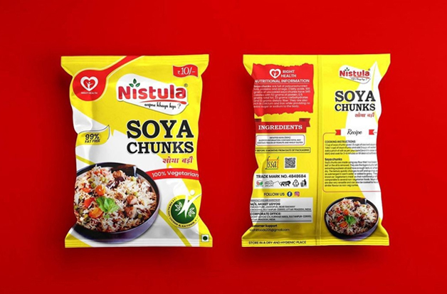
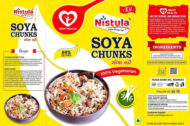
For their product we created an innovative product label tailored to their needs, brand value and the market. We used yellow colour as the background with a visual of a huge white leaf that covered both front and back. The other colours that we used for design were red and green. The text was mostly in black with colour changes when and where needed.
Elements on the front
1) Brand name, logo and tagline
2) Product name in English and Hindi
3) Claim of 99% fat free and 100% vegetarian
4) Price
5) A visual with text ‘Right Health’
6) A visual of mouthwatering fried rice with soya chunks in a bowl
7) A small visual with text healthy living and eating
Elements on the Back
1) Brand name, logo and tagline
2) Product name in English and Hindi
3) Cooking instructions
4) Little tid-bits about soya chunks
5) The same visual of mouthwatering fried rice with soya chunks in a bowl that was on the
front
6) Nutritional information
7) Ingredients
8) Best before, trade mark number and approvals
9) Information regarding customer support
10) Parent brand name and address
11) Storage instructions
For easy ordering for their customers we designed their website with a user friendly interface and optimized it for both mobile and computer use. The website was created in such a way that it also reflects a cohesive picture of the brand’s personality. Correct keywords were used throughout the website for SEO.

Concept
Yellow colour has an optimistic feel to it while also giving an impression that the product is original and economical. Combined with red, both the colours act like an appetite stimulant and excite potential customer. The green colour was used to denote that the product is natural and healthy. The white colour was used for cleanliness and purity. The text on the entire packaging with a few exceptions was in black since the colour tends to stand out when paired with light and bright colours which provides contrast and results in increased legibility. Except the background all other colours were also chosen because they are in the logo of the brand and overall will enhance the brand identity. Two visuals related to health were chosen because they are in line with the brand’s vision of focusing on its consumer’s health. The cooked rice visual was for attracting the attention of potential customers. The product name was in both English and Hindi since the product was launched from Uttar Pradesh where the majority of population speaks Hindi.
Keyline Diagram

THE RESULTS
Nistula loved the product design and was pleased as well as satisfied with it because it not only displayed their product but also reflected their brand values of being conscious about the health of their consumers.

