Services
-
Branding
-
Creative Concept
-
Digital identity
Services
-
UI/UX Design
-
Banner Design
-
Logo Design
Services
-
Social Media
-
Lifestyle Photography
-
Lifestyle Videography
About The Brand
Pozit is a soap and detergent company that believe in providing their customers with best value for their money. They are committed to 'washing with care.' Their detergents, in particular, are harsh on stains and grime while remaining mild and gentle on the skin. They believe in creating products that are unsafe for stains and germs yet absolutely safe for skin.
The Challenge
Pozit came to us with challenge for developing the product design for their new liquid detergent that was going to be launched in a few weeks.
Our Work
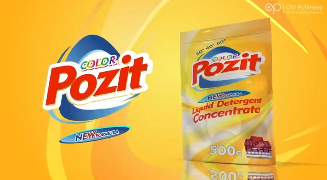
For their product, we created a unique product label that was not only tailored to their as well as the market’s needs but also reflected their brand values. We primarily used yellow colour for the packaging, accentuated by little white for the background. Other colours that we used in the design were red and blue. The text was mostly in black with colour changes when and where needed.
Elements on the front
1) Brand name and logo
2) Claim of new formula
3) Product name
4) Price
5) Visual of clean and folded clothes
6) Quantity
Elements on the Back
1) Brand name and logo
2) Product name
3) Description about the product
4) Details about the manufacturer and marketer
5) Details for customer feedback / complaints
6) Directions to use and Caution
7) Batch Number, manufacturing date, best before, price and quantity
8) Claims of being plant based, cruelty free, recyclable and made in India with small icons

Concept
Yellow has an upbeat vibe to it, while also conveying the idea that the product is unique and cost-effective which is in line with Pozit’s brand value of providing their customers with products of great quality but economical prices. The white colour was used to highlight the product's properties of cleanliness and purity. The blue colour also conveyed a sense of cleanliness along with trust, and strength whilst the red colour was used to draw attention to the product name. The visual of clean clothes was used to demonstrate that the clothes are spotless after being washed. To generate strong contrast and boost readability, the majority of the text was written in black. With the exception of black, all of the colours chosen are also present in the brand logo and serve as a way to add to the brand’s identity.
The Result
Pozit was pleased with the label design since it accurately portrayed the product and its features, as well as the brand's belief in giving customers the most value for their money.

