Services
-
Branding
-
Creative Concept
-
Digital identity
Services
-
UI/UX Design
-
Banner Design
-
Logo Design
Services
-
Social Media
-
Lifestyle Photography
-
Lifestyle Videography
About The Brand
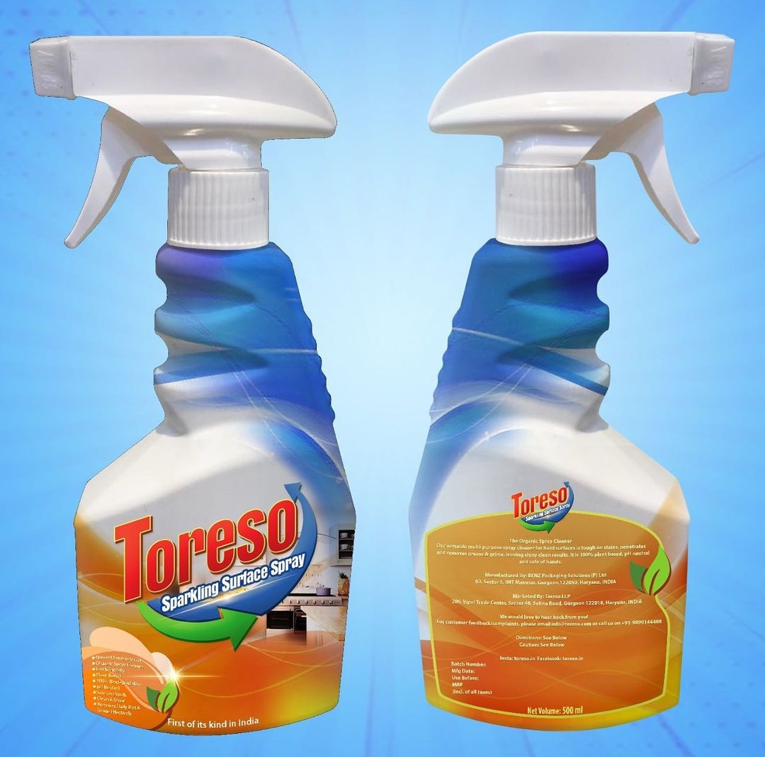
Toreso is cleaning surface cleaning spray that is manufactured by BENZ Packaging Solutions [P] Ltd and is marketed by Toreso LLP. It is a multipurpose spray cleaner for hard surfaces and is organic, plant based, PH neutral and safe on hands. The product removes dirt, grease and grime rleaving behind clean and shiny surface. This product is first of its kind in India.
The Challenge
Toreso LLP came to us with the challenge of designing their product packaging for launch of their new Multipurpose cleaning spray.
Our Work
We designed an original product label for their product that was targeted to their requirements, brand value, and market. The primary colours that we used in the packaging were blue, white and orange with hints of red, green, yellow and purple. The other colours that we used for design were red and green. The text was mostly in light yellow with colour changes when and where needed.
Elements on the front
1) Product name and logo
2) Benefits of the product
3) Visual of a sparkling clean kitchen
4) Small visual of two leaves
5) Claim of being first of its kind in India
Elements on the Back
1) Product name and logo
2) Description about the product
3) Details about the manufacturer and marketer
4) Details for customer feedback / complaints
5) Directions and Caution
6) Batch Number, manufacturing date, best before, price and quantity
7) Visual of two small leaves

Concept
The blue colour is used to convey a sense of cleanliness, trust and strength while the slight purple accents in it denote power and magic alluding to the powerful and magical cleaning capabilities of the product. . The white colour is utilized to emphasize the product's properties of cleanliness and purity. Orange is an eye-catching colour and is used to draw attention to the sections where the product's benefits and critical information are presented. The use of yellow accents lends a sense of optimism. All of the colours incorporated, with the exception of purple, are also used in the product logo and contribute to the product's identification. Because the product is natural and plant-based, the image of the two green leaves is used to represent its connection to nature. The image of a gleaming kitchen is used to demonstrate product usage.
For easy ordering for their customers we designed their website with a user friendly interface and optimized it for both mobile and computer use. The website was created in such a way that it also reflects a cohesive picture of the brand’s personality. Correct keywords were used throughout the website for SEO.
THE RESULTS
Our partners were extremely satisfied with the product design because it not only showcased the features of their product but also added a sense of uniformity due to the use of logo colours in product package design.

